Let’s talk about designing in ALL CAPS. No, seriously. If the association with an obnoxious flame war isn’t enough to dissuade you from typesetting ALL CAPS then consider the inherent taxation on reading speed. Jakob Nielsen explains, “Reading speed is reduced by 10% and users are put off by the appearance of shouting.”
If ALL CAPS is so evil then why are we talking about it? Well, sometimes ALL CAPS looks damn good. My favorite application being short headings, centered with ample tracking, adorned with an underline.
Perfectly Centered Heading + letter-spacing
In CSS a type’s tracking is controlled with the letter-spacing property and leading with the line-height property. While they both take a single value, there is an important difference in the way they distribute that value. line-height implements half-leading, spreading the value equally above and below the type.1 You’d think that letter-spacing would resemble this and split the spacing evenly on each side of the character. However, this inevitably would introduce ugly and inconsistent left-hand alignment. Instead, letter-spacing allocates all the spacing to right of characters.
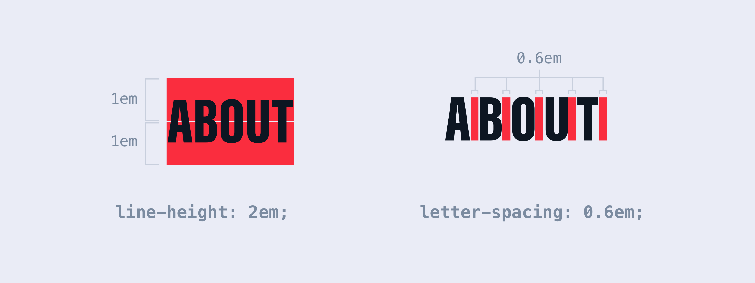
This is fine for the majority of text, but causes issues when center- or right-justifying. The extra padding on the last character shifts text within it’s block-level container resulting in the text being off-center by half the value set for letter-spacing (full value for right-justified text). To fix this we can translate the whole heading:
About
.wrap {
  text-align: center;
}

h1 {
  display: inline-block;
  letter-spacing: 1em;
  text-transform: uppercase;
  transform: translateX(0.5em);
}
Adding an Underline
Adding an underline to your heading helps embelish the design, but you need to watch for the same issue with the trailing padding on the last character. Generally, I would use border-bottom to display the underline, but the trailing padding on the last character forces the underline to hang out awkwardly to the right of the text. For more control we’ll use the ::after pseudo element:
About
h1::after {
  background-color: #C4C9E0;
  content: ' ';
  display: block;
  height: 2px;
  left: 0;
  position: absolute;
  right: 1em; /* prevents overhang */
}
This will draw the underline at the bottom of the h1’s line-height. Increasing the line-height will push the underline down, but also give you a gap above the text and push everything below the h1 down. If you want to move the line up or down without affecting anything else you can add a bottom property and move it using that.
Wrapping it up
ALL CAPS + extra tracking is much more an art than a science, you’ll need to do your own experiments. That said, I generally use 0.2em as my starting point and adjust as needed.
Using pixels for letter-spacing is a pain, you’re much better off to use em so that in the future when you change the font-size you won’t need to readjust. Sketch is a little funky as the tracking is set in pixels whereas Photoshop increments in 1/1000th of an em, so 0.2em = 200.