The decision to reimagine our brand came after our successful trial run of Fanpics at SDSU. The old logo (and that’s really all it was) was a crowd-sourced design that had served us well, but wasn’t fully representing Fanpics. At the end of the day you do need a logo to represent you as a brand, but before designing we needed to condense all the reasons that Fanpics exists into a single guiding light.
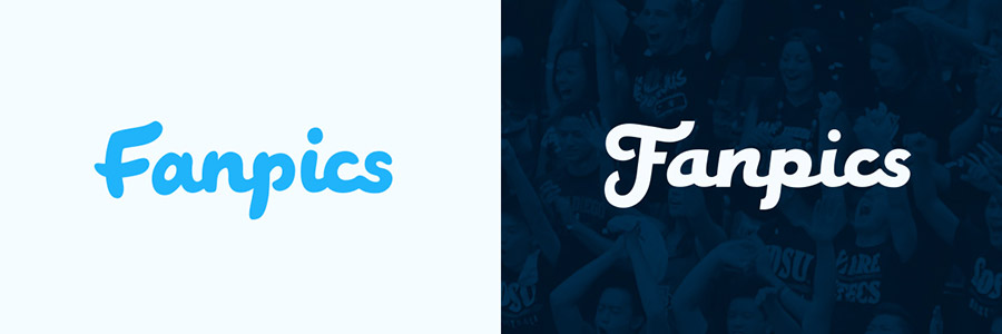
The before and after!
It took some serious introspection and discussion, but eventually the team agreed that the most important thing we believed in was the power and importance of each fan’s gameday narrative. Every fan has a story and Fanpics exists to help those fans tell it. Any sports fan can reach back and retell when they experienced a huge moment; the impossible comeback, championship win, or simply an incredible play. Those are lasting memories. We feel, and now have validated, that if we can capture those moments for fans to relive and share it provides a huge enhancement to the gameday experience.
A bit grand and abstract, how do you boil that into a logo? That is just the cornerstone of our ethos, and it cascades into more tangible values that translate into visual representations. From that we settled on three values that we wanted our brand to convey:
- Simple. Not just because simplicity is crucial element of any successful logo design, but we wanted to make sure that a fan’s story isn’t clouded by Fanpics’.
- Fun. Win or lose the gameday is a story of entertainment and excitement and Fanpics is there to supplement that experience by adding surprise and delight.
- Authentic. We’ll be the first to admit that taking pictures of every fan in a stadium raises privacy concerns and we aim to assure fans that our intentions are purely to enhance their lives. If we can communicate that we are authentic and then demonstrate it, we will build trust.
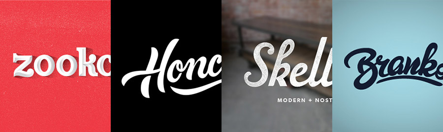
Some of our top inspirations going into the project. Looking at this and what we ended up with you can tell what a process of discovery we went through. I think we gathered too much inspiration from what we thought was ‘cool’ and not necessarily what was appropriate. Lesson learned!
While we had been connecting on the background thoughts we also had collected some inspiration that we felt hinted at the look & feel we were after, but never fully encapsulated our principles. With these as a baseline it was time to start sketching! What seemed like a straightforward prompt turned out to be a lot more difficult than I’d imagined. Often my initial attempts felt too skewed in one of the three directions.
A sampling of the many pages I filled with sketches
For a long time we thought we wanted to stick with a script type because the whole team liked that in our old logo. Several variations from our sketches we cleaned up, but they just weren’t feeling right. The complexity of forms just didn’t jive with the simplicity in essence we were chasing.
A couple script versions that also were a bit too fun and playful.
Concurrently, I was working on an icon to accompany our type, we had shortlisted a few ideas: shield, ticket stub, camera, and stadium. I don’t fancy myself the most skilled illustrator, so this was a challenge for me, but luckily our established preference for simplicity made the task manageable.
Some of my favorite icons that hit the chopping block.
Working through what seemed like endless ideas and iterations three things started to pop out: The first was a positive reaction all around for the font Bardot, despite my hours toiling away at hand lettering. Second, of all the icons, shields resonated; they spoke sports but could be drawn so they didn’t feel as intense and overbearing. Third, we were starting to gravitate towards a color palette that included cream, dark blue, cyan and a light red. Within these three revelations I began a new round.
Some of my favorite shield icons.
From this point it was mostly refinement. We easily selected the shield, paired it with Bardot, and tweaked the colors until everything felt right.
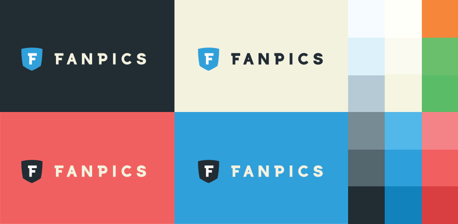
The final logo and colorways plus our full palette.
Our new mark embodies all of the hard work and thinking from our team, consistent with our brand values and design aspirations. It’s more modern, but maintains the authentic feeling we wanted. It’s simple, granting us flexibility to fit in with today’s modern sports lexicon. And it’s fun, fans now recognize us as helping them re-live their game day stories. But perhaps most importantly, it feels like us, it feels right, it excites our team and is one we were all excited to get behind.