I regularly receive questions from developer friends who are a bit baffled with images and their confusing formats. I’ve also heard that they hate receiving a PSD with no instructions and having to wade through the overwhelming options of Photoshop. This short guide is aimed at explaining the basics of image formats and giving you some simple rules that you can apply everyday when while saving images from Photoshop.
Part 1: Getting Familiar with JPG & PNG
There are only two types of image formats you will use when developing for the web: PNG and JPG. Between these two we will be able cover the gamut of any web or mobile app.
JPG is for Photos
If you have a photo it should be a JPG format. This part is pretty simple. JPG does not support transparency and is lossy, meaning that while saving the photo through Photoshop the color information of some pixels will be approximated from the color information of surrounding pixels. This approximation results smaller file sizes but at the expense of artifacts and fuzziness. This is great for photos because the fuzziness will get masked by the complexity/variations of color and luminance in photos.
PNG is for Graphics
Generally, any graphic (icon, interface element, texture, etc.) you have will be a PNG. Unfortunately this isn’t as clear of a rule as with JPG, as we’ll touch on later. PNG is lossless, meaning all of the color information for every pixel is retained. This is both good and bad—good because you are guaranteed to have crisp and clean graphics, bad because this often results in larger file sizes when you have a ton of colors (AKA a large gamut).
What About GIF?
Don’t use GIF, it is an old standard that has been replaced by PNG. Except…it has the ability to support animation, so it isn’t going anywhere, but for the average web or mobile app GIF isn’t applicable. 1
Alpha & Color-Depth of PNG
There are two main components to a PNG—color and alpha (AKA opacity or transparency). Both color and alpha information can have different bit-depths which are independent of each other and can be swapped to meet your needs. First, What are they and what are your needs?
Color can be one of two main bit depths: 8 or 24. PNG-8 gives you up to 256 indexed colors and PNG-24 gives you 16 million non-indexed colors. Indexed and non-indexed refers to the file structure of the colors. Both PNG-8 and PNG-24 save the color information as 24-bits (8 Red, 8 Green, & 8 Blue). The difference is that with indexed files (PNG-8) this color information is saved in a separate area called the palette and each pixel has 8-bits that reference one of those colors.
Non-indexed (AKA truecolor) color means that the information for each pixel is the full 24-bits of color information.
Since the color information is stored separately in the palette, reducing the number of colors in your PNG-8 files makes a noticeable impact on file size. The numbers of colors you can have in a PNG-8 image can be anything from 2–256, below is a selection: 2
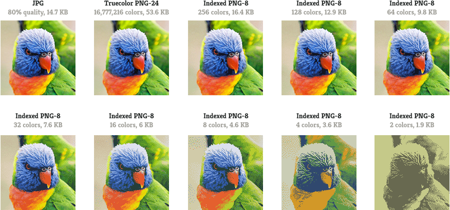
The key here is getting a grasp of the tradeoff between loss of quality and improvements in file sizes as you restrict the colors. This is also a great example of why photos should be JPG—the file size is comparable to the PNG-8 with 256 colors, but the quality superior.
Alpha can be one of two states:
1-bit: either a pixel is 100% opaque or 100% transparent (this is the only transparency GIF supports)
8-bit: each pixel can have a value of see-through-ness ranging from 0 (transparent) to 255 (opaque). 3
This leads us to the question—which alpha should be used? As a general rule if you have a graphic that is going to only show up against one solid color or has pixel-sharp edges you should use 1-bit, this is actually not very common. If you have a graphic that has any sort of softness/fading/gradation in the transparency you will need an 8-bit alpha layer. Below is a chart that demonstrates what to expect with the different alpha layers.
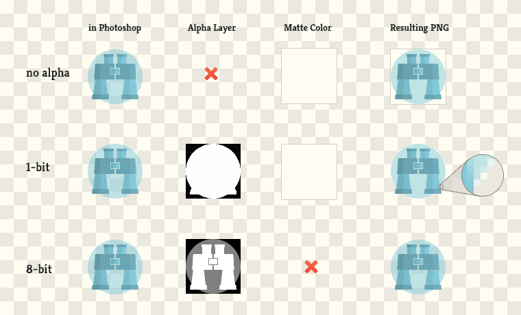
You might have noticed the Matte Color from above. If you try to save an image with a range of transparency (for example the 50% opacity circle behind the binoculars) coupled with only 1-bit alpha or no alpha channel then Photoshop needs figure out how to make all the colors fully opaque. The solution is to put a solid color behind the image in order to make pixels either 100% opaque or 100% transparent. This often leads to a halo effect around your image, which can be downright ugly unless your image is only going to live ontop of your matte color. This leads us to the question, what else should I be aware of when exporting from Photoshop?
Part 2: Saving Images from Photoshop
At some point you’re probably going to need to crack open Photoshop either when a designer hands you a PSD file or when you’re working on your own project and there isn’t a designer yet. 4 But there are a ton of settings in Photoshop that get extremely overwhelming, so I’ll do my best to explain what you should pay attention to and the rest you can ignore.
Preparing to Save
This is not the most orthodox method, but it works for me and it is pretty straightforward. 5 Essentially, you want to isolate each image in a new file and have no padding around the graphic and then save it. Here is the quick step by step:
- Select all the layers that comprise the single graphic you are cutting
-
Copy Merged
alt+⌘+ecreates a new layer with all of your layers merged together. This is better than simply MergeLayer>Merge Layers | ⌘+ebecause it does not destroy any of the design you are working with. If your image changes appearence in this step it's likely that your blending modes are causing this. Masking is probably your solution: A Complete Beginner’s Guide to Masking in Photoshop -
Select all
Select>All | ⌘+a -
Cut
Edit>Cut | ⌘+x -
New Document
File>New | ⌘+nPhotoshop automatically fills in the dimensions of the graphic you just cut, but change the Background Contents to Transparent. -
Paste
Edit>Paste | ⌘+v -
Save for Web
File>Save for Web | shift+alt+⌘+sNow you’ve got the file completely isolated and ready to save.
Save for Web
By now you should have a good idea of when you will want to use PNG or JPG; however, in some cases the best format is unclear. For example, an illustration that doesn’t need any transparency might look fine as both a PNG-8 or a JPG—Save for Web helps you make this decision by giving you the file size of each format. Whichever format has the smallest file size while still being an acceptable quality will be the best choice. Remember, if you need any transparency then you’ll want to use a PNG. Below is what you should see once you open up Save for Web:
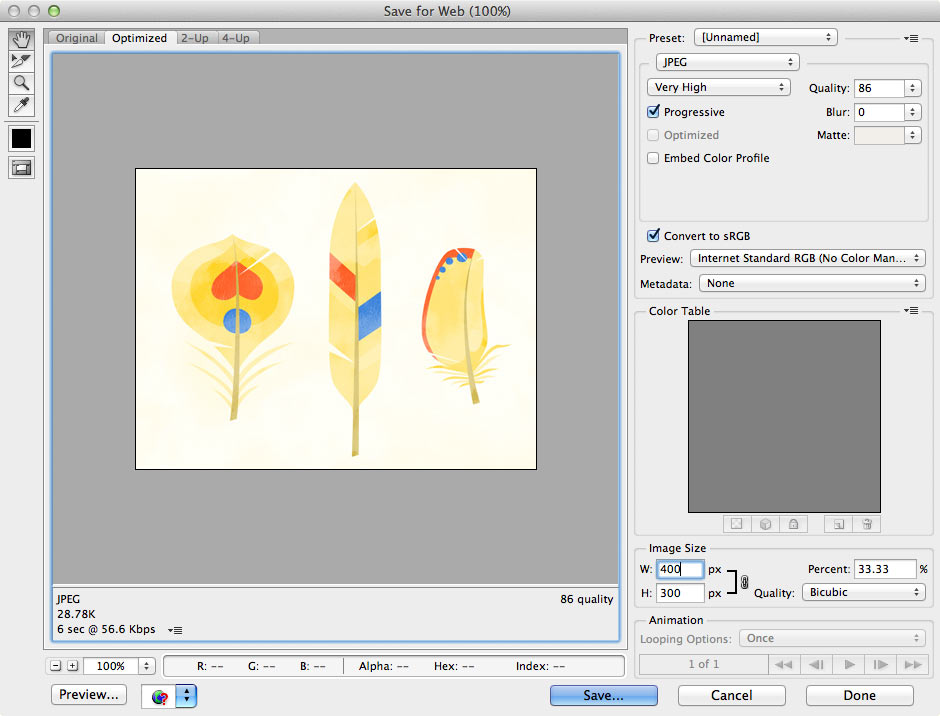
What to pay attention to: JPG
Quality is up to your tastes—you’ll just need to move the slider around to see what looks acceptable while not being an overly large file. I’ve found that the sweet spot is 60–85. Beyond 85 you can’t tell the difference except in file size and below 60 things start to look bad. Definitely don’t go below 51 otherwise Photoshop starts to implement an additional compression technique that really destroys quality. 6
Progressive means that the JPG is downloaded in chunks and after only a little of the image has downloaded it will be displayed full size, but blurry. As more of the file is download the image will rerender with a higher degree of clarity. Without progressive a JPG needs to completely download before displaying, leaving a glaring open space on your page. Having something there, even if it is a chunky and blurry version, is a better experience. I always use progressive and it generally doesn’t impact file size much, but keep an eye on the size in case.
Convert to sRGB—keep checked for both JPG and PNG. sRGB is the standard color space of web/monitors/printers/etc, keep checked for all. 7
Metadata - unless these are photos that you want to make sure retain copyright information, I leave this at none.
Embed Color Profile—uncheck. this information gets ignored by browsers.
PNG-8
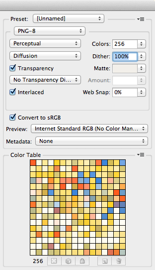
Colors - If you cut down on the colors the file size will shrink. However, if you lowered the colors to 128 when there are only 120 colors it won’t make a difference on the file size. Remember, number of colors can be anything from 2-256, not just the options they give you—its an editable drop down.
Transparency - check if there is any transparency to the image, will only be 1-bit transparency.
Web Snap - remember when we had to use websafe colors only…haha, leave at 0%.
Interlaced - same idea as progressive for JPG but for PNG, check it.
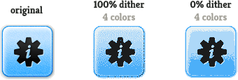
Dithering is the process of adding noise between colors and is really useful when working with limited palettes like in PNG-8's. You can see in the buttons that with the same amount of color we get much smoother gradients and defined details. Just leave dithering slammed at 100%.
PNG-24
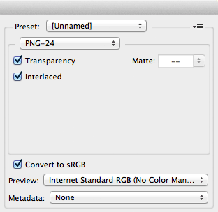
Transparency - check if there is any transparency to the image, will be 8-bit alpha.
Everything else follow the same guidelines provided for PNG-8s.
PNG-8 + 8-bit Alpha
Here is the frustrating part of all of this, Photoshop doesn’t support the export of an indexed PNG coupled with 8-bit Alpha layers, which conveniently is the most useful combination for web images. Luckily, there is a free Mac app ImageAlpha that has a great GUI for converting these. I’m sure many of you would prefer to use the command line…and you can use PNGQuant…but I highly recommend you use a GUI. By trying out different numbers of colors to find the lowest acceptable quality you can really shave down the file sizes. Be sure to export files from Photoshop as PNG-24 before converting them otherwise you won’t get the alpha channel. Both of these options also allow you to make a PNG with alpha that degrade nicely in IE6. 8
Optimization
This only applies to images destined for the web and for the most part only PNG as the gains for JPG are negligible. 9 Once you have your files exported the last step is to run them through an image optimizer. There are a ton of options for achieving this, and as I feel most comfortable using a GUI, I use ImageOptim. The command line alternative is PNGCrush. Below you can see the gains from using optimization on various files:

Look at the savings with The Wiki Game icon in particular—we shaved 75% of the file size! That said, look closely at the pixels and you will see the dithering. Whether this acceptable or not is up to you. Also, coupled with sprites you can see how powerful this becomes.
Conclusion
I hope this has helped clear up any confusion you've had about images. I'd just like to note that I'm using Photoshop CS6 and the settings may be slightly different on other versions. Now go make beautiful images that are super fast to load…